Phyloseq: Basic Microbiome Analysis Tutorial
This tutorial will go over Phyloseq which further analyse data generated from a basic microbiome analysis tutorial using AMPtk pipeline. This SOP/tutorial includes 1) Alpha diversity analysis, 2) Taxonomy barplot, and 3) Beta Doversity analysis. This tutorial dose not require installation, you can simply click and your browser will bring up everything you need for this tutorial.
บทเรียนนี้จะสอนการใช้ Phyloseq เบื้องต้นเพื่อวิเคราะห์ข้อมูลที่ได้จาก การวิเคราะห์ข้อมูลความหลากหลายของจุลินทรีย์(ไมโครไบโอม)เบื้องต้น โดยผู้เรียนไม่ต้องดาวน์โหลดโปรแกรมลงบนคอมพิวเตอร์ส่วนตัว เพียงคลิกที่ ข้อมูลและโปรแกรมจะเปิดขึ้นมาบนหน้าเว็บ และ พร้อมใช้งานได้ทันที (หมายเหตุ: หากมีผู้ใช้งานจำนวนมาก อาจใช้เวลามากกว่า 10 นาทีในการเปิดหน้าเว็บ) การวิเคราะห์ข้อมูลไมโครไบโอมโดยการมช้ Phyloseq ที่จะกล่าวถึงนั้น มี 3 ส่วน คือ Alpha diversity analysis, 2) Taxonomy barplot และ 3) Beta Doversity analysis
Step A: Open Binder to launch RStudio

Once you click on , your web browser should bring up a similar RStudio as the picture shown above.
Let’s check several things before we begin.
# Check that you can load 'Phyloseq' package
# Check 'Phyloseq' version => should be ‘1.30.0’
# if you don't get the same results, something probably went wrong
# you will need to re-launch the binder

> library(phyloseq)
> packageVersion("phyloseq")
[1] ‘1.30.0’
Step 1: Load and process data
Load example data using command data("GlobalPatterns"), then check that the phyloseq object is constructed by typing GlobalPatterns. Phyloseq results should show up indicating that the object contains 1) otu table, 2) sample data, 3) taxonomy table, and 4) phylogenetic tree.
> data("GlobalPatterns")
> GlobalPatterns
phyloseq-class experiment-level object
otu_table()   OTU Table:         [ 19216 taxa and 26 samples ]
sample_data() Sample Data:       [ 26 samples by 7 sample variables ]
tax_table()   Taxonomy Table:    [ 19216 taxa by 7 taxonomic ranks ]
phy_tree()    Phylogenetic Tree: [ 19216 tips and 19215 internal nodes ]
The first step of data processing is to remove any OTUs that present only one time (singletons).
> GlobalPatterns.prune = prune_taxa(taxa_sums(GlobalPatterns) > 1, GlobalPatterns)
Let’s check whether our data are pruned or not.
> GlobalPatterns
phyloseq-class experiment-level object
otu_table()   OTU Table:         [ 19216 taxa and 26 samples ]
sample_data() Sample Data:       [ 26 samples by 7 sample variables ]
tax_table()   Taxonomy Table:    [ 19216 taxa by 7 taxonomic ranks ]
phy_tree()    Phylogenetic Tree: [ 19216 tips and 19215 internal nodes ]
> GlobalPatterns.prune
phyloseq-class experiment-level object
otu_table()   OTU Table:         [ 16854 taxa and 26 samples ]
sample_data() Sample Data:       [ 26 samples by 7 sample variables ]
tax_table()   Taxonomy Table:    [ 16854 taxa by 7 taxonomic ranks ]
phy_tree()    Phylogenetic Tree: [ 16854 tips and 16853 internal nodes ]
GlobalPatterns contains 19216 taxa while GlobalPatterns.prune has 16854 taxa. Therefore, we removes singletons in our dataset.
Check read counts: any samples that have very low reads should be removed. Ref
# load ggplot2 and data.table package which will be use for generating plots
> library(ggplot2)
> library(data.table)

# Check read count
> readcount = data.table(as(sample_data(GlobalPatterns.prune), "data.frame"),
                 TotalReads = sample_sums(GlobalPatterns.prune),
                 keep.rownames = TRUE)
> setnames(readcount, "rn", "SampleID")
> ggplot(readcount, aes(TotalReads)) + geom_histogram() + ggtitle("Sequencing Depth")
Plot will show up in plot window and we will see the distribution of our samples readcounts.
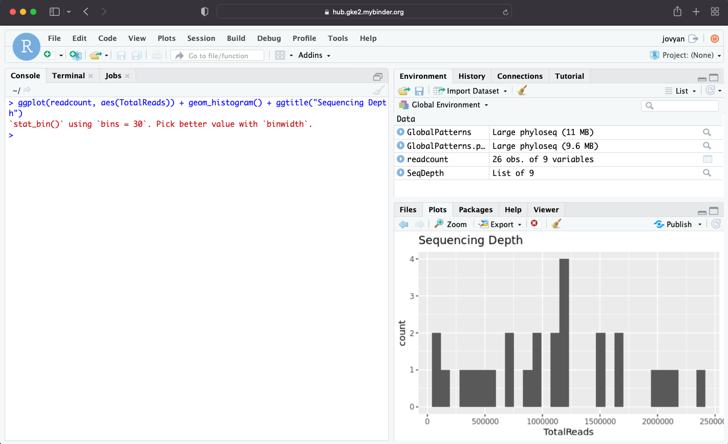
In order to check samples with low number of reads, “order()” can be used to sort “TotalReads” column.
> head(readcount[order(readcount$TotalReads), c("SampleID", "TotalReads")])
   SampleID TotalReads
1:  TRRsed1      58637
2:  M11Tong     100180
3:  F21Plmr     186260
4:  TRRsed3     279573
5:  M11Plmr     433825
6:  TRRsed2     492957

# readcounts in all samples look okay, no need to remove any samples.
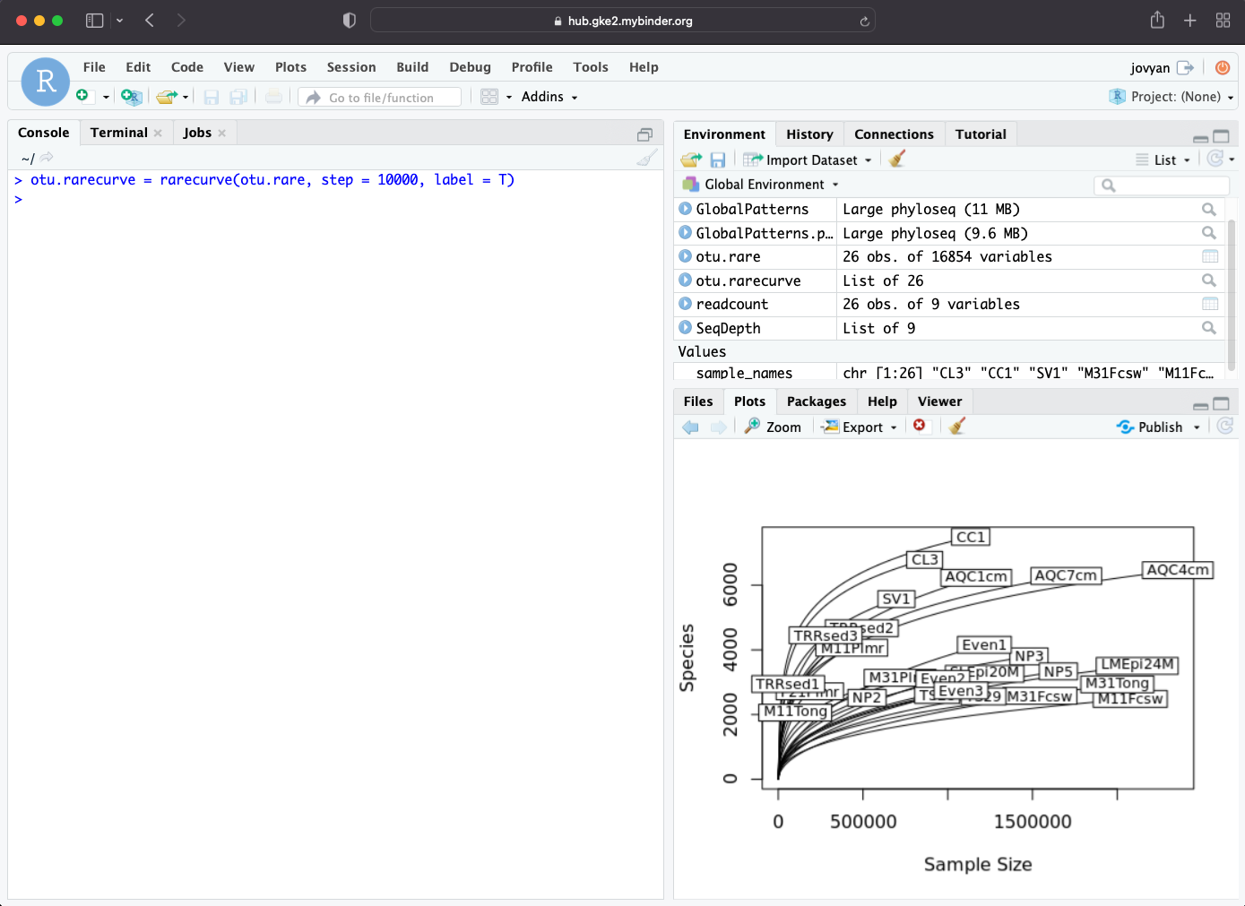
Generate rarefaction curve, rarefaction curve could be used to determined whether the sequencing depth cover microbial diversity of the sample.
> otu.rare = otu_table(GlobalPatterns.prune)
> otu.rare = as.data.frame(t(otu.rare))
> sample_names = rownames(otu.rare)

# we will use vegan rarecurve
> library(vegan)
> otu.rarecurve = rarecurve(otu.rare, step = 10000, label = T)
Rarefaction curve will show up in Plots window.
STEP 2: Plot Alpha Diversity
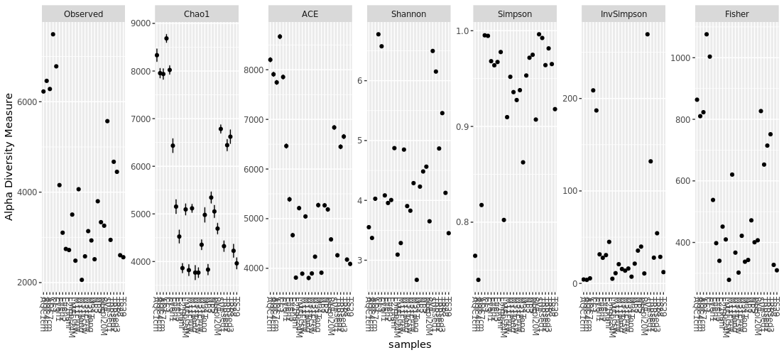
Alpha diversity measure can be Observed, Chao1, ACE, Shannon, Simpson, InvSimpson, and Fisher
You can simply plot richness for all of your data using “plot_richness(your_phyloseq_object)” with all possible alpha diversity measure. This plot will show if your data can be plotted with all of the alpha diversity measure. However, you should select one index to represent your data.
> plot_richness(GlobalPatterns.prune)
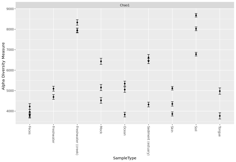
You can add more details to your graph and select only the alpha diversity measurement that you would like to use. In the following command, x = “SampleType” indicate that x-axis will be plotted/grouped by SampleType and measures = c(“Chao1”) for selecting only Chao1 index.
> plot_richness(GlobalPatterns.prune, x="SampleType", measures=c("Chao1"))
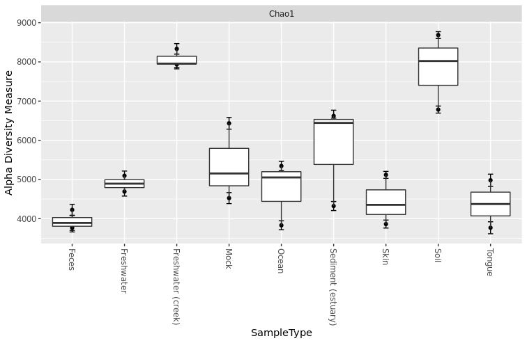
Adding boxplot to your graph to show group trend
> plot_richness(GlobalPatterns.prune, x="SampleType", measures=c("Chao1")) + geom_boxplot()
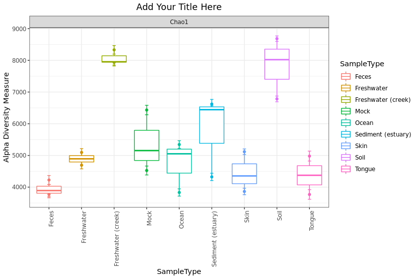
Prepare your plot for publication by adding more details such as color and title
> plot_richness(GlobalPatterns.prune, x = "SampleType", color = "SampleType", measures = c("Chao1")) +
  geom_boxplot() + theme_bw() + ggtitle("Add Your Title Here") +
  theme(plot.title = element_text(hjust = 0.5)) +
  theme(axis.text.x = element_text(angle = 90, hjust = 1))
STEP 3: Generating taxnomic barplot
To show how to get barplot, we will use only the top 100 OTUs. To get the top 100 OTUs, we would sort the taxa and add to “psTopNOTUs” *For you data, you should skip this step if you doesn’t want to get only the top 100 OTUs.
> psTopNOTUs = names(sort(taxa_sums(GlobalPatterns.prune), TRUE)[1:100])
Once we have the top 100 OTUs names, we can prune/filter them using prune_taxa command.
> pstop.prune = prune_taxa(psTopNOTUs, GlobalPatterns.prune)
Barplot using default setting from Phyloseq for all samples
> plot_bar(pstop.prune)
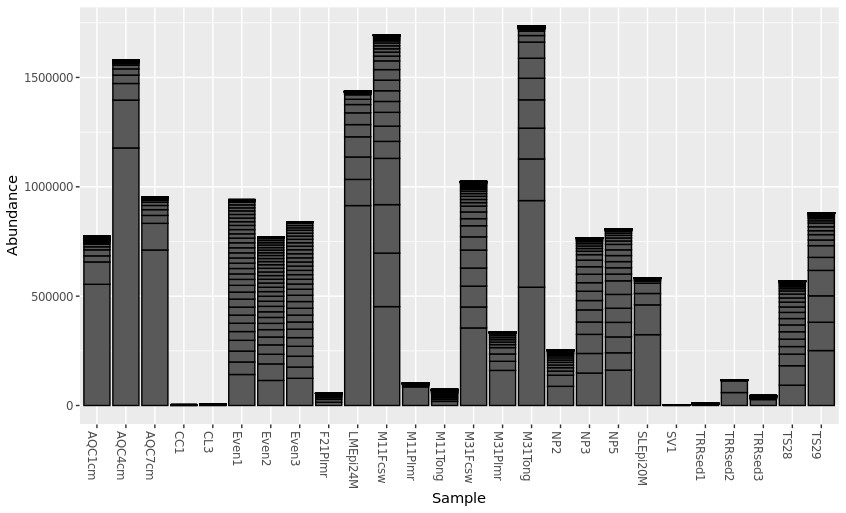
Specify details for the barplot using fill = “taxnomic_rank”. “fill” is used to specify taxonmic rank that will be plotted. For example, this plot uses “Phylum” for taxnomic composition.
> plot_bar(pstop.prune, x = "Sample", y = "Abundance", fill ="Phylum")
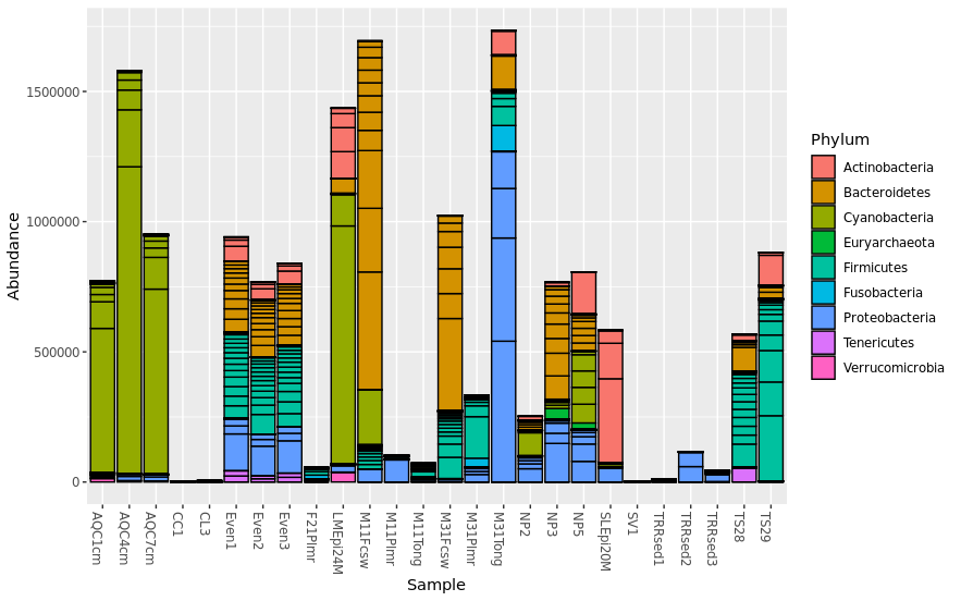
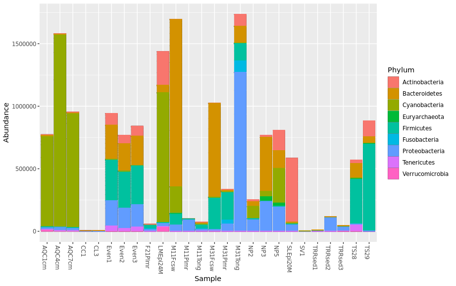
Remove black containers that were used to separated Phylums by adding “geom_bar(aes(color=Phylum, fill=Phylum), stat=”identity”, position=”stack”)”
> plot_bar(pstop.prune, x = "Sample", y = "Abundance", fill ="Phylum") + geom_bar(aes(color=Phylum, fill=Phylum), stat="identity", position="stack")
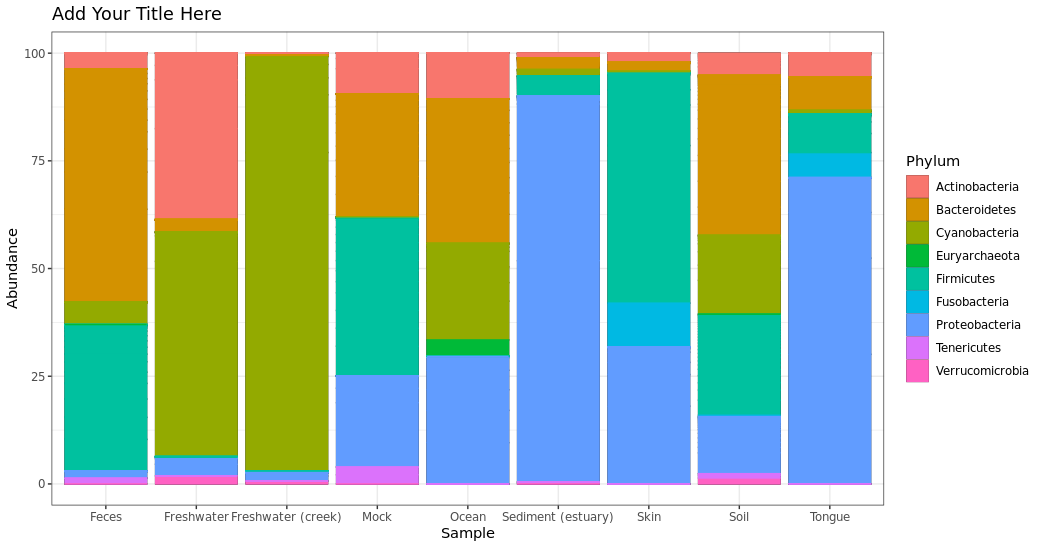
Plotting in groups instead of individual samples: If we want to group the samples by specific category, you can use “merge_samples” to combine your samples. In this case, we will use “SampleType”, but you can use any column in your metadata file (such as description, disturbance, species, etc.) Then, we mearge sample data as well using “factor(sample_names())”. Lastly, we will transform the data to see barplot in 100% abundance.
> pstop.prune.merge.SampleType = merge_samples(pstop.prune, "SampleType")
> sample_data(pstop.prune.merge.SampleType)$SampleType = factor(sample_names(pstop.prune.merge.SampleType))
> pstop.prune.transform.SampleType = transform_sample_counts(pstop.prune.merge.SampleType,
                                                      function(x) 100 * x/sum(x))
Barplot taxonmic composition using transform data and also merged samples by SampleType
> plot_bar(pstop.prune.transform.SampleType, x = "Sample", y = "Abundance", fill ="Phylum") +
  geom_bar(aes(color=Phylum, fill=Phylum), stat="identity", position="stack") +
  ggtitle("Add Your Title Here") + theme_bw()
STEP 4: Beta diversity and ordination plot
Calculate ordinate and distance: current methods are “DCA”, “CCA”, “RDA”, “CAP”, “DPCoA”, “NMDS”, “MDS”, and “PCoA”. Distance can be selected based on the method used.
> GlobalPatterns.prune.ord <- ordinate(GlobalPatterns.prune, "PCoA", "unifrac")
Plot ordination with default setting
> plot_ordination(GlobalPatterns.prune, GlobalPatterns.prune.ord)
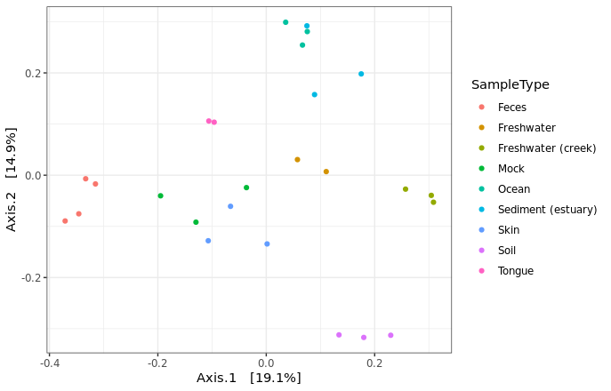
Adding more details by specifying different SampleType using differnt colors. If you have other catagory, you can add different shape to your graph. The shape palette can deal with a maximum of 6 discrete values because more than 6 becomes difficult to discriminate; our data have 9, we won’t add shape to the plot.
> plot_ordination(GlobalPatterns.prune, GlobalPatterns.prune.ord, type = "samples",
                color = "SampleType") + theme_bw()
